View more case studies:
Flash
Scope
Complete mobile app redesign
Heuristic evaluation & Analysis of Pain Points;
Maps: Concept Map, Mind Map;
Wireframe (low-fi);
UI & Design System;
Prototype
Timeline
February 2023 – March 2023
Tools
Adobe Illustrator,
Figma,
Google Jamboard,
Milanote
Flash is a digital wallet app, the first in the Montenegro / Balkan region with Montenegrin founders. They make NFC and QR code payments possible, as well as bank transfers. Both sending and requesting payments are possible through the app, as are recurring payments and discounts available at partner stores in the country. All other available apps in this region are those of financial institutes, which is why Flash is in a good market position to fill in the gaps, like cross-bank payments from a single app.
Problem Statement
Flash needed its MVP app redesigned, to align more with its users’ needs. After their initial MVP app design was finished, unmoderated qualitative research has been conducted to detect usability issues. Many pain points were revealed by users finishing 10 short tasks and adding their general comments and a score of the task difficulty.
Pain Points
Intuitiveness & Previous Knowledge
Users weren’t familiar with the different types of transfers the app offers. After onboarding and arriving at the home screen, it wasn’t obvious to them at the first sight what the app does and what can they use it for.
UX writing & Previous Knowledge
Users weren’t familiar with the term NFC payment. This lead to the conclusion that UX writing has to be changed according to familiarity of the users.
Onboarding
The onboarding process included too many steps and asked for partially unnecessary information, that could be eliminated from the process.
Feedback & Information
At finishing some flows, feedback or confirmation of the success of the flow was missing. In another task, some users had difficulties finding information on the discount program the app offers.
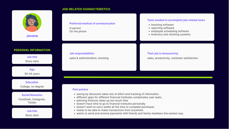
Users and Audience
Users of the app were defined by first creating a user persona. To make this hypothetical user group more accurate, demographic data of concurrent mobile apps were filtered into the creation of this user persona, while we kept specifics of the Montenegrin market in mind.
Design Process
1
heuristic evaluation and an analysis of the MVP app design. Studying of research results of previous testing to detect usability issues
The Heuristic Evaluation of the app design detected a number of potential usability issues. Partially, these hypotheses were proven right by the results of the unmoderated user testing that took place after the initial app design was created. The problems that were detected and approved by the previous testing, were handled as pain points we needed to solve with the redesign.


Analysis and Heuristic Evaluation of the initial app design
2
Redesigning User flows, User persona, Creating Maps of IA & Navigation
Following the markup of the analysis conducted in the first step, user flows were created to detect the functionalities that users will need to have available in the app interface. After the user flows were written down, concept maps and mind maps were drawn to outline an Information Architecture and Navigation concept for the app. These were reiterated until the main navigation was created, which was basically all shown in 1 wireframe of the Home page.


The idea behind the new navigation was to have a link to all primary functions of the app, which are all transfer sorts (sending transfer by NFC, QR code or phone number/contact number, requesting transfer by NFC, phone number/contact number, pay online by reading a QR code). Additionally, from the Home page, any other sections of the app had to be available through a link, which is why the navigation bar was added with the 4 sections of the app: Home (all transfer types), History of Transfers, Discounts (the benefits users receive by using the app), Profile (incl. Settings).
3
Creating wireframes
Wireframes were drawn on paper first. Later on, some of the screens were re-drawn in Figma in higher fidelity, but still very rustic, to avoid jumping into UI conclusions. At this point we focused on component designs with flows in mind and were following a top-down approach.


The 4 sections of the app were drawn as wireframes to include all screens the main navigational flows would demand. Then the screens of the payment flows were added, all starting from the Home screen, to show the purpose of the app clearly to any new user that lands here after the onboarding steps. From here, there were only a few screens needed that had a bridging role between steps a user would take during any flow. Screens of feedback were only added in the UI phase.

Wireframes
4
Creating a new design system & UI
The new visual interface of the app had to be one that builds on the existing app (law of familiarity) and includes Accessibility guidelines, all while respecting the Brand guidelines too. The briefing of the customers was concise: not to include any illustrations and needless visuals, to keep a serious visual brand language. Brand keywords were: serious, trustworthy, clear. The brand colors were guiding the process of choosing shades for the app components and screens. The current interface has a light-theme, but the color shades are already defined for the creation of a dark-theme as well.


5
app prototype
The prototype was created for 15 flows to present a full picture of app functionalities. It’s been reviewed by the developers and it’s prepared to be used for testing purposes.

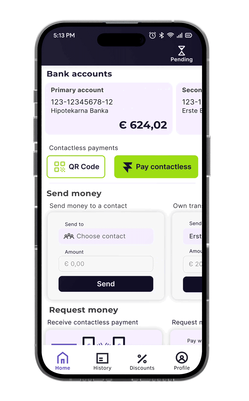
The payment flows were made more intuitive due to the overlay actions. Users don’t need to leave the home screen anymore to go through a number of screens to make payments. Instead, there is an overlay dedicated to each step of the transaction flow, and ensuring of the outcome with feedback. This is a scalable yet efficient way to simplify and automatize the steps a user has to take to fulfill a task.
Outcomes and Conclusions
This project is still in the pre-testing phase and the real outcome of the redesign will be more visible through its results. Nevertheless, we hope that the new app design has made an impact on the usability of the MVP. We will focus in our testing on the following areas to detect measurable impact:
• UX writing
Some buttons had confusing or difficult-to-understand labels, e.g. “Send NFC”. Users from our target group had difficulties understanding this because some of them didn’t know what NFC was.
Question: Are the new labels easy to understand for first-time users?
• Accessibility
We aimed to improve: Color contrasts • Touch areas of Buttons • Form Labels • Placeholders • Help text and Instructions • Typography (font sizes and spacing).
Question: Is the new UI following accessibility standards?
• Navigation
The navigation of primary and secondary functions of the application, as well as Cross-section navigation were in focus when the redesign was created.
Question: Is the new Navigation intuitive for our users?
Method: Qualitative testing combined with a short interview. Users will also rate the difficulty of each task.
• UI & design system
The new design system was built on company brand guidelines, and while it kept some elements of the previous UI, most of the components have received a new structure and look in an attempt to improve usability and accessibility.
Question: Is the new interface in alignment with a consistent visual identity?
• Usability
We aimed to improve the intuitiveness of flows, as well as to add clear and concise action feedback.
Question: Is our current interface design improving usability? Are users completing payment tasks more easily?

